Data visualisation and infographics agency in Geneva

Figures you can read at a glance.

Interactive charts, dashboards, maps and infographics for international organisations, public administrations and businesses. We turn data tables into clear, accurate and accessible visualisations.

Featured

01

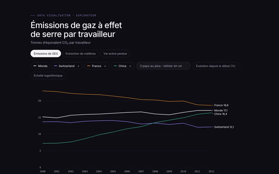
Country explorer

ILO · Greening with jobs 2018 · Dashboard

Three environmental indicators, nearly 180 countries, from 2000 to 2015. Compare up to three countries with the world average, in values or as change, then place each one among all the others.

  • Searching and adding countries
  • Values or change in %
  • Logarithmic scale
  • Accessible data table
Graphic design: CM Design · Development: IÖN
Interactive · try itFull screen ↗
02

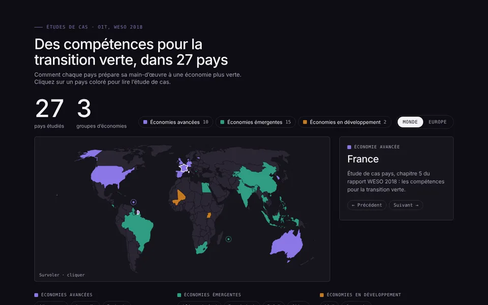
Skills for the green transition

ILO · Greening with jobs 2018 · Interactive map

27 country case studies, split into three groups of economies. The legend works as a filter, a click opens the country profile, and a Europe view makes small countries legible.

  • Vector map without a library
  • Filter by group
  • World / Europe zoom
  • Keyboard-accessible country list
Graphic design: CM Design · Development: IÖN
Interactive · try itFull screen ↗
03

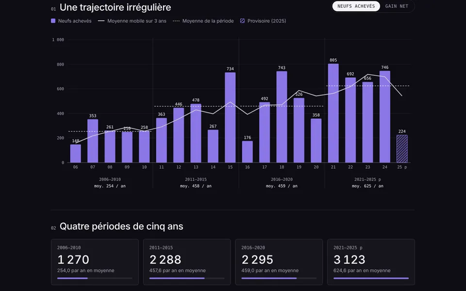
Twenty years of new housing in Geneva

OCSTAT public data · Data story

An official statistical series told in three parts: the year-by-year trajectory, four five-year periods, then the balance of what adds and removes housing.

  • Moving average and averages by period
  • New / net gain toggle
  • Balance sheet waterfall
  • Explicit reading limits
Graphic design: CM Design · Development: IÖN
Interactive · try itFull screen ↗
Gallery

Fifteen visualisations, one standard.

Click a thumbnail to open the interactive visualisation full screen.

Method

From spreadsheet to published chart.

  1. 01

    Understanding the data

    Sources, units, missing years, provisional series: we check everything before drawing, and flag anything that needs to be confirmed.

  2. 02

    Choosing the form

    One question, one chart. Compare, track over time, place on a map or let readers explore: the form follows from what the reader needs to understand.

  3. 03

    Designing and developing

    Your brand guidelines, colours checked for colour-blind readers, animations that guide reading and crisp rendering from phone to giant screen.

  4. 04

    Publishing and keeping it alive

    Integration into your website or CMS, PNG, PDF or CSV export, and data updates when new figures come in.

Frequently asked questions

Questions we are often asked.

Which tools do you use to create your visualisations?

We write custom charts in SVG and JavaScript, with D3 when the project warrants it. No platform subscription: the files belong to you and can be integrated into any website.

Are the charts accessible?

Every visualisation has a title and a description for screen readers, a data table, keyboard navigation, colours checked for colour-blind readers, and respects the “reduce motion” setting.

Can they be integrated into our website or CMS?

Yes: as a standalone page, an iframe or a component in WordPress, Drupal or a bespoke CMS. The charts adapt to the available width, from phone to projection screen.

How is the data updated?

From a CSV or JSON file, a spreadsheet or an API. Depending on your needs, updates are made by your teams, automatically or by us.

Do you also create infographics for print?

Yes. With CM Design, we adapt the same visualisations for printed reports, presentations and social media, with shared brand guidelines.

How much does a data visualisation cost?

It depends on the number of charts, their interactivity and the state of the data. After an initial conversation, we send a detailed quotation.
Let’s talk about your data

New tab ↗